SwiftLeeds 2024 (day 1)
It's that time of year again!
SwiftLeeds 2024 is here, and in this post, i'll be sharing my thoughts on the first day of the conference.
Agenda:
-
From Side Project to Going Indie - Antoine van der Lee.
-
Multi-Platform Libraries with Swift for WebAssembly - Max Desiatov.
-
Building an Accessibility Culture, One Step at a Time - Bas Broek.
-
Speeding up protocol conformances in Swift - Noah Martin.
-
Hidden engineering challenges of A/B Testing - Anastasia Petrova.
-
Swift Concurrency is new and different and hard and you can do it - Matt Massicotte.
-
Crafting better App Icons - Flora Damiano.
-
How LEGO can inspire us to build better UI Libraries - Joseph El Mallah.
From Side Project to Going Indie - Antoine van der Lee
Key Takeaways:
-
Prepare
-
Mindset
-
Never quit because it becomes challenging
-

-
Learn by shipping
-
-
Goals & Planning
-
Goals visualize progress; progress leads to motivation
-
A tool to not do too much: you’ve already reached your goal
-
Write all tasks out, it is easier to track.
-
Create issues for everything, even when the task is already completed.
-
The first step is the hardest, break it into smaller steps
-
-
-
Get into action
-
Development Practices
-
Creating and Utilizing a Personal SDK for Reusability (Benefit of Isolation and Focus)
-
Tests will save you time
-
-
Marketing & Audience Growth
-
REPURPOSE YOUR KNOWLEDGE GAINS
-
Learn something, Blog about it, Repurpose on social media, Apply to your product
-
Only ~2% of your followers will see your post
-
Use automation to repost evergreen content
-
Ensure to at least have 3 posts per day
-
Repost for different timezones
-
Create a Personality (Make your personal account likable)
-
-
Financial Strategies
-
Make sure to know how to measure important metrics
-
Monthly Recurring Revenue (MRR)
-
Annual Recurring Revenue (ARR)
-
Gross vs. Net
-
-
Define Your Offering
-
Build a recurring income with auto-renewing subscription (if it makes sense)
-
Be careful with lifetime
-
Your product grows and evolves; the lifetime price remains the same
-
-
Offer a free experience to add opportunities to upsell
-
-
-
-
Reflect
-
Sustaining Your Indie Career
-
Time management and prioritization becomes even more important
-
Everything impacts your income, so it’s easy to overwork
-
Planning your days is crucial, you might need to force yourself to take time off
-
Always Remember Your Core Values
-
You do what you love
-
You’ve got flexible working hours
-
More time with your family
-
-
-
More information on going-indie.com.
Multi-Platform Libraries with Swift for WebAssembly - Max Desiatov
Key Takeaways:
-
WebAssembly Text Format (.wat extension) used for debugging
-
WebAssembly binary modules (.wasm extension) used for distribution
-
With WASI syscalls you can interact with the host environment (e.g. filesystem, network, this requires explicit permissions)
-
Wasm is a virtual instruction set designed for security and efficiency
-
WASI defines API and ABI for accessing the host system
-
Apps can embed a Wasm runtime for plugins-like functionality
Resources:
Demo code available on GitHub: https://github.com/apple/swift-for-wasm-examples
WasmKit source repository: https://github.com/swiftwasm/wasmkit
Join the conversation at "Swift for WebAssembly" Forums section: https://forums.swift.org/c/related-projects/swift-for-webassembly/71
Building an Accessibility Culture, One Step at a Time - Bas Broek
Key Takeaways:
-
Accessibility is an us problem.
-
What's (not) accessibility?
-
☑️ Localisation
-
☑️ Dynamic Type
-
☑️ Autocomplete
-
☑️ Dark mode
-
☑️ Sensory feedback
-
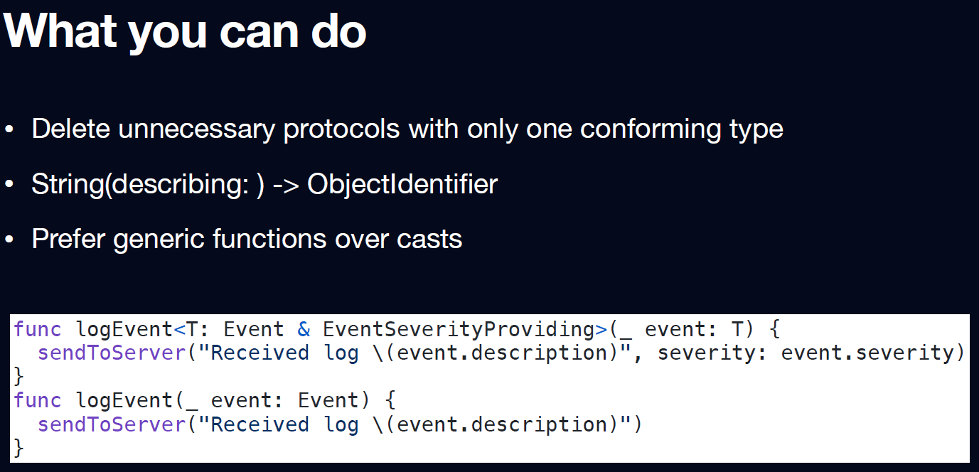
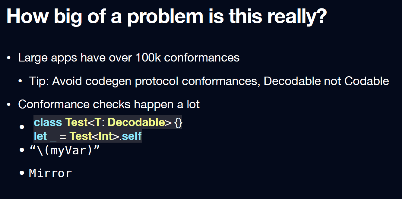
Speeding up protocol conformances in Swift - Noah Martin
Key Takeaways:
-
Don't use protocola (and conformances) if not needed.
-

-

For more info see this topic on the Swift Forums, or read more about it on the blog of Emerge Tools.
Hidden engineering challenges of A/B Testing - Anastasia Petrova
Key Takeaways:
-
A/B testing makes customer support harder and FAQ's unreliable
-
Removing A/B testing can be tricky if it is based on (a lot of)
if #available(..)modifiers. -
a good way to update/enroll isn't using willEnterForgeground.
-
Most experiments fail.
-
1 of 8 experiments succeed.
-
A/B testing is an expensive way of saying "I disagree with your idea".
Swift Concurrency is new and different and hard and you can do it - Matt Massicotte
Matt shared his thoughts on Swift Concurrency and how developers can leverage it in their projects.
Key Takeaways:
-
Switch over to Swift6 concuccency mode if you start a new project.
Do you want to know more about concurrency visit Matt's website or browse Concurrency tags on this blog.
Crafting better App Icons - Flora Damiano
Key Takeaways:
-
Make it Versatile
-
Ensure the effectiveness of your icon design across various platforms and sizes.
The icon will be displayed in multiple locations throughout the platform, emphasizing the importance of maintaining both legibility and uniqueness. -
Complex icons that attempt to incorporate too much information often suffer from poor scalability.
Prioritize the simplicity of lines and shapes during the conceptual stage and favor ideas that can be conveyed through a singular object. -
Avoid the pitfall of attempting to represent diverse functionalities within a single icon, as this can lead to confusion.
Using high-contrasted colors and vibrant shades of the same color is a common approach to ensure recognizability even in smaller usages of your design.
-
-
Make it Consistent
-
Establishing a strong and consistent design language is a potent means of leaving a lasting impression on users.
Effective app icon design serves as an extension of the application's essence. Ensuring alignment between the app's purpose and visual representation enhances the overall user experience, fostering memorability. -
A straightforward approach to achieving this synergy is incorporating dominant colors from the app or branding into the icon.
providing a foundational and consistent element. Additionally, consider transforming existing graphic elements into iconography, further reinforcing the cohesive design language. By maintaining consistency in these visual aspects, you enhance the overall effectiveness and impact of your app icon. -
When you have a multiplatform app or a bundle with multiple apps, consistency will play a big role in how effective the App Icon design is.
Keeping the same visual language also increases recognizability through platforms and markets. This is crucial also when changes to your icons are applied over time.
-
-
Make it Original
-
Make it Memorable
There are some key attributes that you have to make sure that your file matches:
-
Always provide a squared image as an App Icon, don’t apply a corner radius. The system will automatically apply a mask for the platform you are designing for.
-
Work in sRBG or P3 color space. Xcode runs in P3 color space and sRBG almost matches this spectrum, but working in different spaces will result in an inconsistency in colors applied. Since you are working on display only, remember to work on the resolution of 72 dpis.
-
Don’t apply transparency in your background layer. Your app icon will be displayed in different screen scenarios, and having transparency on the background will result in color changes and inconsistency, plus color readability and Xcode errors.
-
PNG file format works best with Xcode and raster quality.
To ensure consistency with the system, you will need to provide 3 different variants of your App Icon: Light Mode, Dark Mode, and Tinted
Resources:
How LEGO can inspire us to build better UI Libraries - Joseph El Mallah
Key Takeaways:
-
Create Composable Views instead of a view for each element you want to show.
-
Composable makes it easier to:
-
Change the requirements
-
Localize
-
Layout direction
-
Accessibility
-
Test
-
Wrapping Up
That's a wrap for day 1 of SwiftLeeds 2024!
Read more
- Exploring ControlGroup in SwiftUI • 3 minutes reading time.
- Build a personal brand as developer • 3 minutes reading time.
- iOS App States • 4 minutes reading time.
Share
Share Bluesky Mastodon Twitter LinkedIn Facebook
