Exploring ControlGroup in SwiftUI
In SwiftUI, a ControlGroup provides a way to visually group controls together, making your UI more intuitive and structured. It helps you present related controls in a unified manner, enhancing the user experience by logically grouping similar actions.
Syntax Overview
Here's a basic example of how to use a ControlGroup:
import SwiftUI

struct ContentView: View {
    var body: some View {
        VStack {
            ControlGroup {
                Button("Action 1") {
                    // Action 1 code
                }
                Button("Action 2") {
                    // Action 2 code
                }
            }
            .controlGroupStyle(.automatic)
        }
    }
}
In this example, we create a ControlGroup inside a VStack, containing two buttons. The .controlGroupStyle(.automatic) modifier ensures that the group adopts the appropriate style based on the context it's used in.
Customizing ControlGroup
While the automatic style is convenient, you can customize ControlGroup to match your app's design. SwiftUI offers different styles, such as navigation and compact.
import SwiftUI

struct ContentView: View {
    var body: some View {
        VStack {
            ControlGroup {
                Button("Action 1") {
                    // Action 1 code
                }
                Button("Action 2") {
                    // Action 2 code
                }
            }
            .controlGroupStyle(.navigation)
        }
    }
}
In the example above, we use .controlGroupStyle(.navigation) to give the control group a navigation-based appearance, suitable for toolbar items.
Practical Example
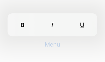
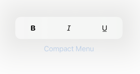
Consider an app where users frequently perform text formatting actions. You can use a ControlGroup to group formatting buttons together, providing a clean and organized interface:
import SwiftUI

struct FormattingView: View {
    var body: some View {
        VStack {
            Text("Formatted Text")
                .font(.title)

            ControlGroup {
                Button(action: boldText) {
                    Image(systemName: "bold")
                }
                Button(action: italicizeText) {
                    Image(systemName: "italic")
                }
                Button(action: underlineText) {
                    Image(systemName: "underline")
                }
            }
            .controlGroupStyle(.menu)
        }
    }

    func boldText() {
        // Bold text code
    }

    func italicizeText() {
        // Italicize text code
    }

    func underlineText() {
        // Underline text code
    }
}.menu:

.compactMenu

In this FormattingView, we group three formatting actions—bold, italic, and underline—using ControlGroup with a .menu / .compactMenu style, making the actions easily accessible and visually appealing.
Interesing Use Cases
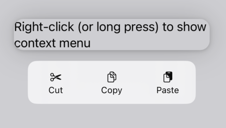
Control groups work great on (context) menu's, see the following example:
import SwiftUI

struct ContextMenuView: View {
    var body: some View {
        VStack {
            Text("Right-click (or long press) to show context menu")
                .contextMenu {
                    ControlGroup {
                        Button {
                             // Cut action
                        } label: {
                             Label("Cut", systemImage: "scissors")
                        }

                        Button {
                            // Copy action
                        } label: {
                            Label("Copy", systemImage: "doc.on.doc")
                        }

                        Button {
                            // Paste action
                        } label: {
                            Label("Paste", systemImage: "doc.on.clipboard")
                        }
                    }
                }
        }
    }
}
Conclusion
ControlGroup is a powerful feature in SwiftUI that enhances the organization of controls in your app. By logically grouping related actions, you can improve the user experience and create a more intuitive interface. Experiment with different control group styles to find the best fit for your app's design.
Read more
- Easy Publishers • 2 minutes reading time.
- Implementing Admob in SwiftUI • 7 minutes reading time.
- Dive into GIT • 8 minutes reading time.
Share
Share Bluesky Mastodon Twitter LinkedIn Facebook
