Customizing macOS windows
MacOS windows are a fundamental part of the user interface, and customizing them can greatly enhance the user experience. In this post, we will explore how to customize macOS windows using SwiftUI.
We will cover how to create a custom window style, add a toolbar.
Window backgrounds
To customize the background of a window, we can use the .containerBackground(_:for:) modifier.
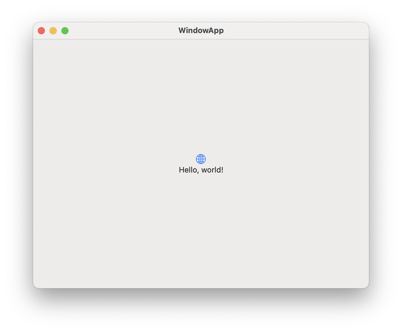
Default window background
The default window background is a solid color. You can set the background color of a window using the .background modifier.
import SwiftUI

@main
struct MyApp: App {
    var body: some Scene {
        WindowGroup {
            ContentView()
        }
    }
}
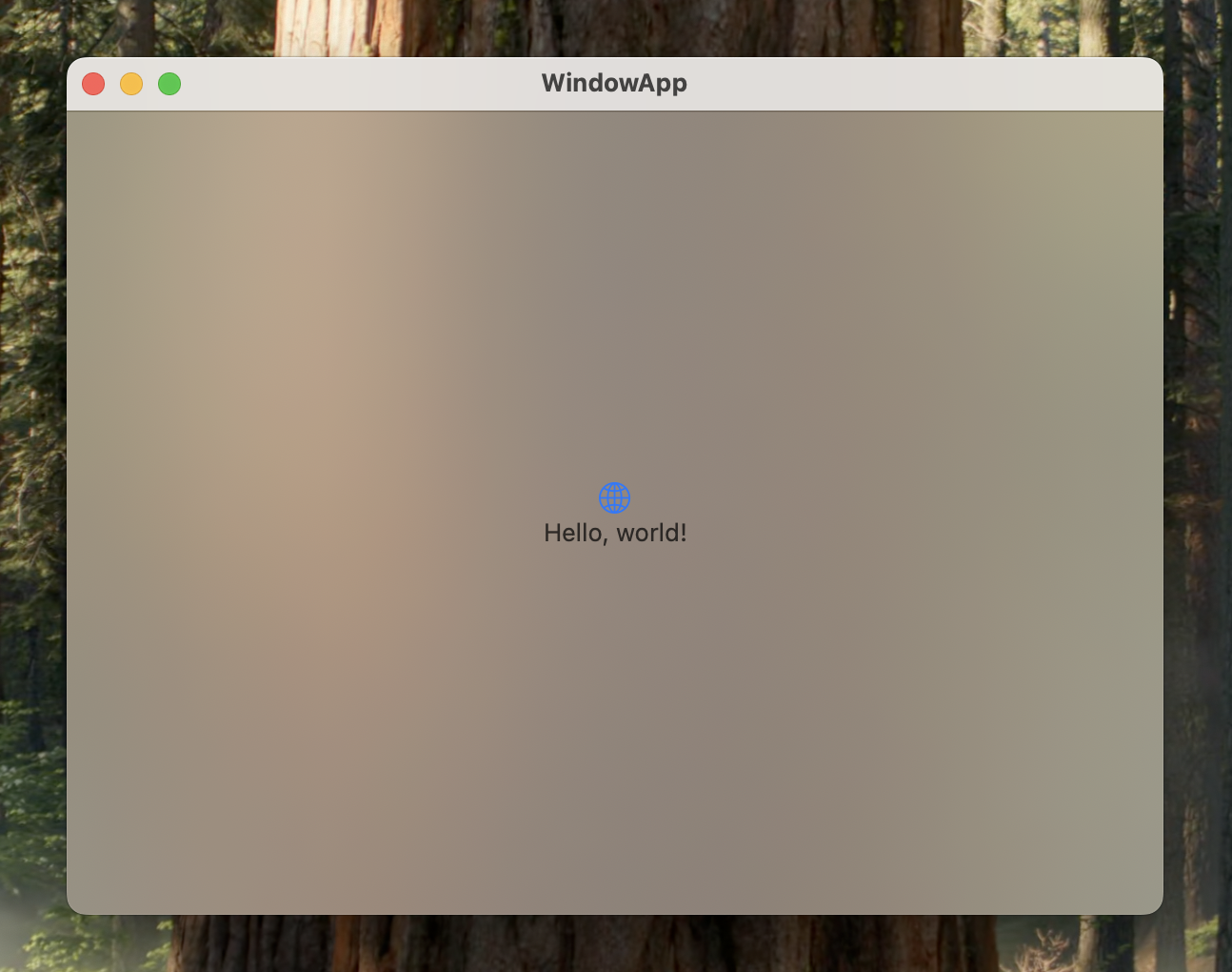
thinMaterial window background
You can use the .containerBackground(_:for:) modifier to set a material background for the window. This will give the window a translucent effect, allowing the content behind it to show through.
import SwiftUI

@main
struct MyApp: App {
    var body: some Scene {
        WindowGroup {
            ContentView()
                .containerBackground(
                    .thinMaterial, for: .window
                )
        }
    }
}
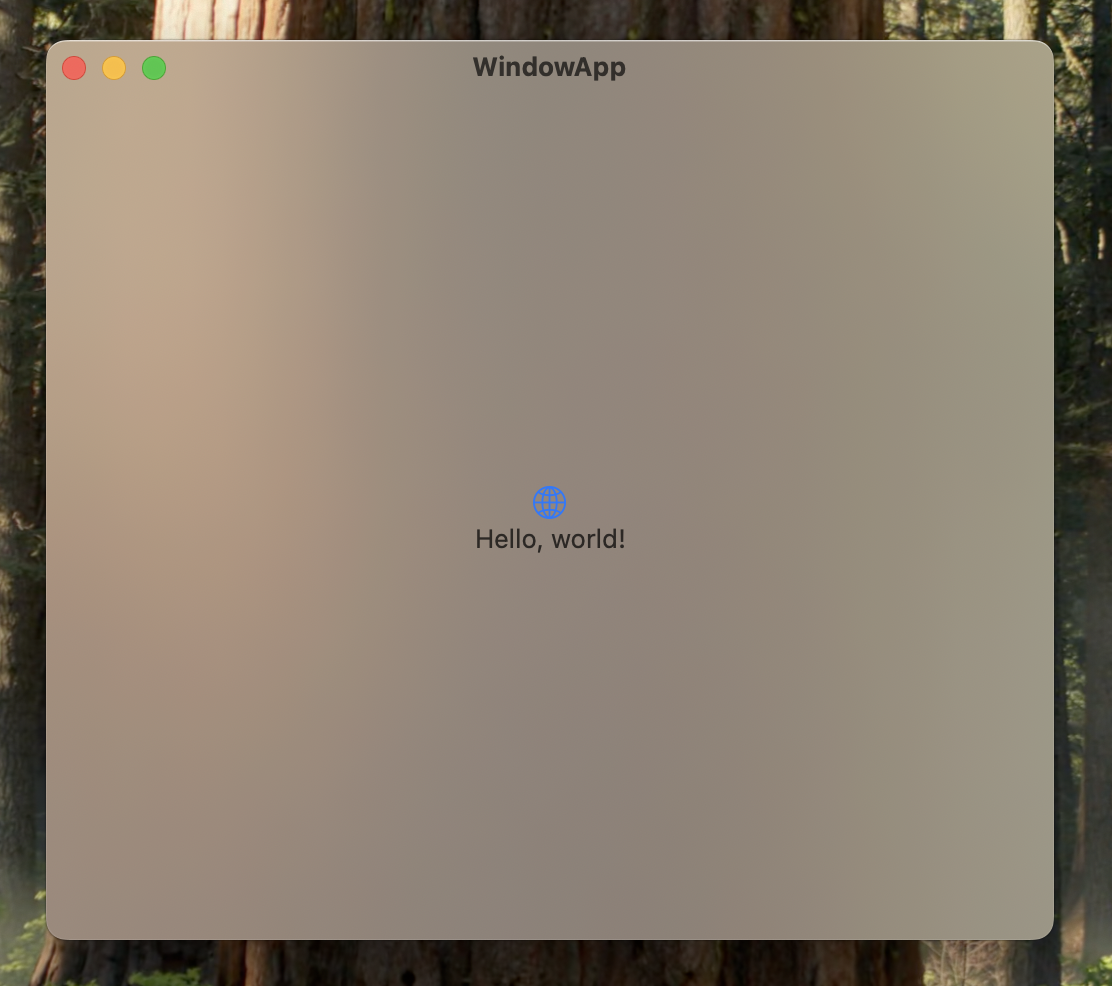
Without toolbar
You can also hide the toolbar of the window by using the .toolbarBackgroundVisibility(_:for:) modifier. This will remove the toolbar from the window, giving it a cleaner look.
@main
struct MyApp: App {
    var body: some Scene {
        WindowGroup {
            ContentView()
                .containerBackground(
                    .thinMaterial, for: .window
                )
                .toolbarBackgroundVisibility(
                    .hidden, for: .windowToolbar
                )
        }
    }
}
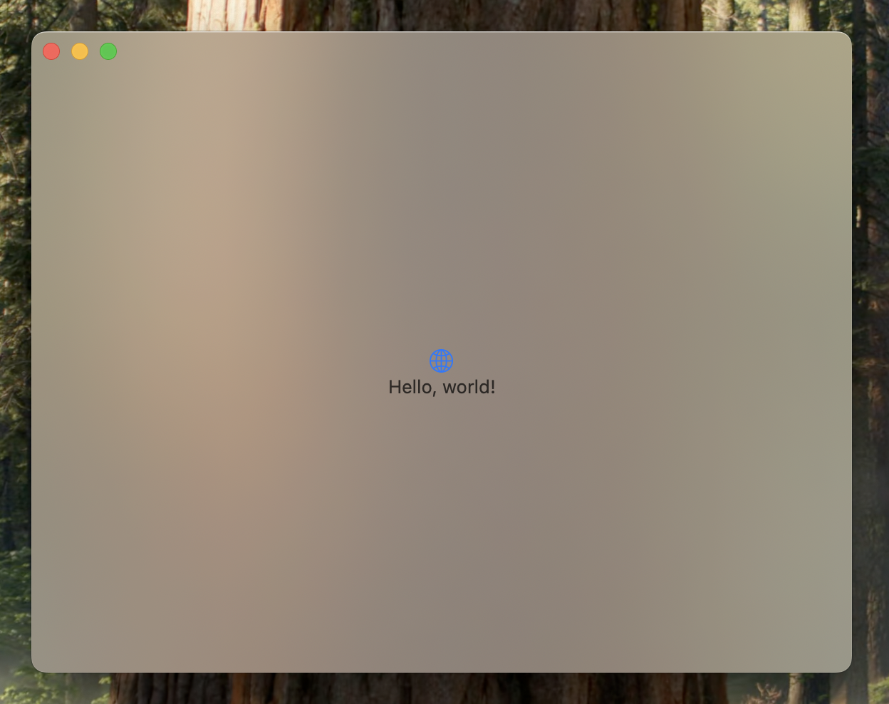
Without title bar
You can also hide the title bar of the window by using the .windowStyle(_:) modifier. This will remove the title bar from the window, giving it a cleaner look.
@main
struct MyApp: App {
    var body: some Scene {
        WindowGroup {
            ContentView()
                .containerBackground(
                    .thinMaterial, for: .window
                )
        }
        .windowStyle(.hiddenTitleBar)
    }
}
Different toolbar styles
You can customize the toolbar style of a window by using the .windowToolbarStyle(_:) modifier. This allows you to change the appearance of the toolbar to match your app's design.
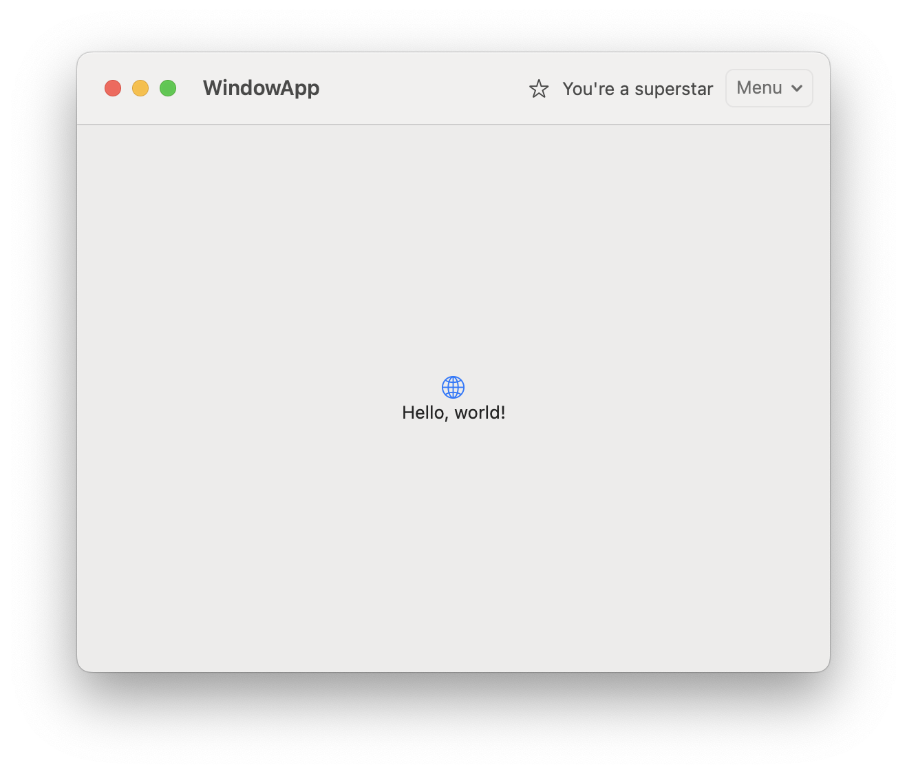
Default toolbar style
The default toolbar style is combined with the window. This means that the toolbar will be displayed at the top of the window, and it will be combined with the window's title bar.
import SwiftUI

@main
struct WindowApp: App {
    var body: some Scene {
        WindowGroup {
            ContentView()
                .toolbar {
                    ToolbarItemGroup(placement: .automatic, content: {
                        Image(systemName: "star")
                        Text("You're a superstar")
                    })
                    ToolbarItemGroup(placement: .automatic, content: {
                        Menu(content: {
                            Button(action: {}, label: { Text("Sub item 1") })
                            Button(action: {}, label: { Text("Sub item 2") })
                        }, label: {
                            Text("Menu")
                        })
                    })
                }
        }
    }
}
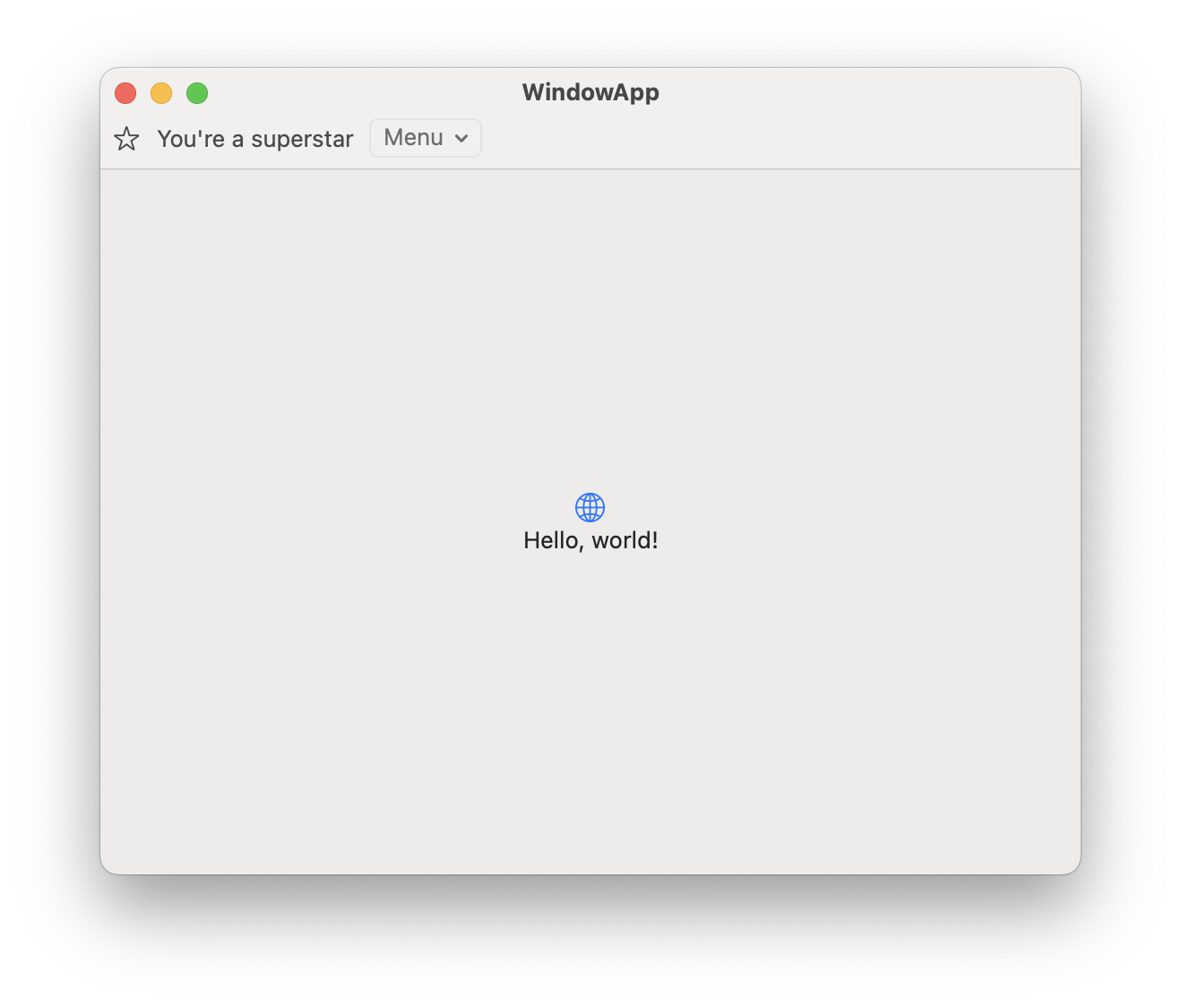
Expanded toolbar style
The expanded toolbar style expands the toolbar to its full width, allowing for more space for the toolbar items. This is useful for apps that have a lot of toolbar items or need more space for their content.
import SwiftUI

@main
struct WindowApp: App {
    var body: some Scene {
        WindowGroup {
            ContentView()
                .toolbar {
                    ToolbarItemGroup(placement: .automatic, content: {
                        Image(systemName: "star")
                        Text("You're a superstar")
                    })
                    ToolbarItemGroup(placement: .automatic, content: {
                        Menu(content: {
                            Button(action: {}, label: { Text("Sub item 1") })
                            Button(action: {}, label: { Text("Sub item 2") })
                        }, label: {
                            Text("Menu")
                        })
                    })
                }
        }
        .windowToolbarStyle(.expanded)
    }
}
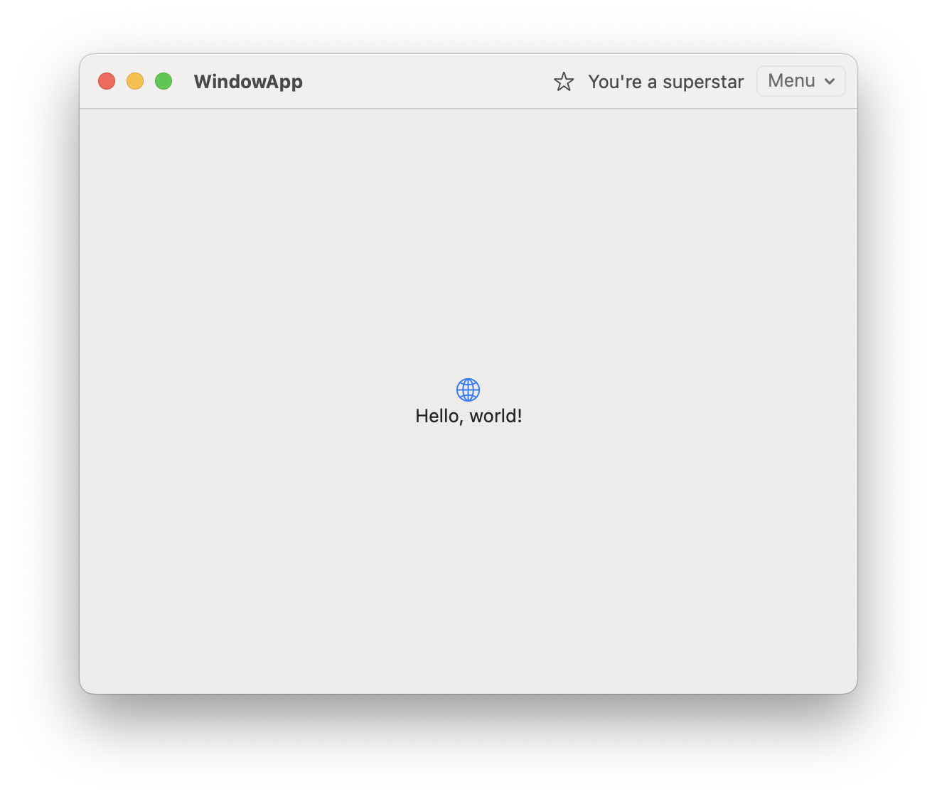
Unified toolbar style
The unified toolbar style combines the toolbar and the window title bar into a single element. This gives the window a more cohesive look and feel, making it easier for users to navigate.
import SwiftUI

@main
struct WindowApp: App {
    var body: some Scene {
        WindowGroup {
            ContentView()
                .toolbar {
                    ToolbarItemGroup(placement: .automatic, content: {
                        Image(systemName: "star")
                        Text("You're a superstar")
                    })
                    ToolbarItemGroup(placement: .automatic, content: {
                        Menu(content: {
                            Button(action: {}, label: { Text("Sub item 1") })
                            Button(action: {}, label: { Text("Sub item 2") })
                        }, label: {
                            Text("Menu")
                        })
                    })
                }
        }
        .windowToolbarStyle(.unified)
    }
}
Unified compact toolbar style
The unified compact toolbar style is similar to the unified toolbar style, but it is more compact. This is useful for apps that have not a lot of toolbar items.
import SwiftUI

@main
struct WindowApp: App {
    var body: some Scene {
        WindowGroup {
            ContentView()
                .toolbar {
                    ToolbarItemGroup(placement: .automatic, content: {
                        Image(systemName: "star")
                        Text("You're a superstar")
                    })
                    ToolbarItemGroup(placement: .automatic, content: {
                        Menu(content: {
                            Button(action: {}, label: { Text("Sub item 1") })
                            Button(action: {}, label: { Text("Sub item 2") })
                        }, label: {
                            Text("Menu")
                        })
                    })
                }
        }
        .windowToolbarStyle(.unifiedCompact)
    }
}
Conclusion
MacOS windows are very customizable, and SwiftUI provides a powerful set of tools to help you create beautiful and functional windows. By using the techniques outlined in this post, you can create a unique and engaging user experience for your macOS applications.
Read more
- Building an Asynchronous Button in SwiftUI • 6 minutes reading time.
- What is @MainActor • 5 minutes reading time.
- Popovers in SwiftUI • 4 minutes reading time.
Share
Share Bluesky Mastodon Twitter LinkedIn Facebook