SwiftUI Buttons
In this post we will explore the different styles of buttons available in SwiftUI, how to create custom buttons, and some best practices for using buttons in your SwiftUI applications.
What are Buttons in SwiftUI?
Buttons in SwiftUI are interactive elements that trigger actions when tapped. They can be styled and customized to fit the design of your application. SwiftUI provides a variety of built-in button styles, and you can also create your own custom styles.
Basic Button Usage
To create a basic button in SwiftUI, you can use the Button view. Here’s a simple example:
Button("My Button") {
    print("Button tapped!")
}
Built-in Button Styles
SwiftUI provides several built-in button styles that you can use to change the appearance of your buttons.
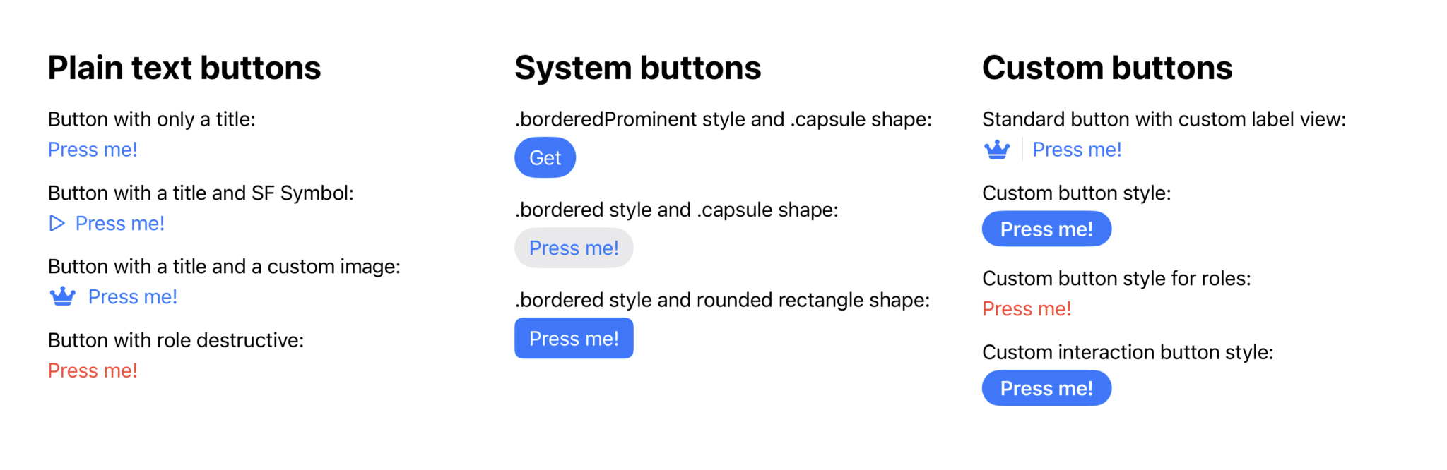
Here are some common styles:
Default Button Style
The default button style is simple and adapts to the platform's design guidelines.
Button("Default Button") {
    print("Default button tapped!")
}
.buttonStyle(DefaultButtonStyle())
Borderless Button Style
The borderless button style removes the border and background, making it suitable for text-only buttons.
Button("Borderless Button") {
    print("Borderless button tapped!")
}
.buttonStyle(BorderlessButtonStyle())
Plain Button Style
The plain button style is used for buttons that do not have any background or border, making them look like regular text.
Button("Plain Button") {
    print("Plain button tapped!")
}
.buttonStyle(PlainButtonStyle())
Bordered Button Style
The bordered button style adds a border around the button, making it stand out more.
Button("Bordered Button") {
    print("Bordered button tapped!")
}
.buttonStyle(BorderedButtonStyle())
Bordered Prominent Button Style
The bordered prominent button style is similar to the bordered style but with a more pronounced appearance, often used for primary actions.
Button("Bordered Prominent Button") {
    print("Bordered prominent button tapped!")
}
.buttonStyle(BorderedProminentButtonStyle())
Button with (SF) Symbols
You can also add icons to your buttons using (SF) Symbols.
This enhances the visual appeal and provides context to the button's action.
Button {
    print("Button with icon tapped!")
} label: {
    Label("Button with Icon", systemImage: "star.fill")
}
Use Case: Custom Button Styles
In this example, we will create a custom button style that changes the appearance of the button when tapped.
struct CustomButtonStyle: ButtonStyle {
    @Environment(\.isEnabled) var isEnabled

    func makeBody(configuration: Configuration) -> some View {
        configuration.label
            .padding()
            // Change the background color to green when pressed, blue otherwise
            // and gray when disabled.
            .background(isEnabled ? (configuration.isPressed ? Color.green : Color.blue) : Color.gray)
            .foregroundColor(.white)
            .clipShape(Capsule())
    }
}

Button("Custom Button") {
    print("Custom button tapped!")
}
.buttonStyle(CustomButtonStyle())
Best Practices for Using Buttons
-
Accessibility: Always ensure that buttons are accessible. Use descriptive labels and consider the size of the button for touch targets.
-
Feedback: Provide visual feedback when a button is tapped. This can be done using animations or changing the button style.
-
Consistency: Use consistent styles for buttons throughout your application to create a cohesive user experience.
-
Avoid Overloading: Don’t overload buttons with too many actions. Each button should have a clear and singular purpose.
Conclusion
Buttons are a fundamental part of user interaction in SwiftUI applications. By understanding how to use and customize buttons, you can enhance the usability and aesthetics of your app. Remember to follow best practices to ensure that your buttons are accessible, provide feedback, and maintain consistency across your application.
Read more
- Creating a dynamic user interface for extensions in Aurora Editor • 10 minutes reading time.
- How to monitor network in SwiftUI • 3 minutes reading time.
- Observable Geocoder • 3 minutes reading time.
Share
Share Bluesky Mastodon Twitter LinkedIn Facebook