SwiftUI ViewModifiers
SwiftUI ViewModifiers are a powerful tool for customizing and enhancing views in your app. They allow you to encapsulate common view modifications into reusable, composable units, making it easy to apply the same changes to multiple views throughout your app
What is a View modifier?
View modifier is a very important concept of SwiftUI. If you have a chance to play around with SwiftUI you might have seen one already like .background, .padding, ...
SwiftUI already provided plenty of modifiers, but you can also create a custom one with a simple protocol, ViewModifier.
Example 1: Blue Border
struct BlueBorder: ViewModifier {
    func body(content: Content) -> some View {
        return content
            .padding(2)
            .border(.blue, width: 1)
    }
}
Use it like this:
Import SwiftUI

struct ContentView: View {
    var body: some View {
        VStack {
            Text("Hello, World!")
                .modifier(BlueBorder())
        }
    }
}
Or you can create an extension to make it more readable:
extension View {
    @warn_unqualified_access
    func blueBorder() -> some View {
        self.modifier(BlueBorder())
    }
}
Then you can use it like this:
Text("Hello, World!")
    .blueBorder()
Example 2: Card view
struct CardBackground: ViewModifier {
    func body(content: Content) -> some View {
        content
            .padding(10)
            .background(
                Color(UIColor.systemGroupedBackground)
            )
            .cornerRadius(20)
            .shadow(
                color: Color.black.opacity(0.2),
                radius: 4
            )
    }
}
Use it like this:
Import SwiftUI

struct ContentView: View {
    var body: some View {
        VStack {
            Text("Hello, World!")
                .modifier(CardBackground())
        }
    }
}
Or you can create an extension to make it more readable:
extension View {
    @warn_unqualified_access
    func cardBackground() -> some View {
        self.modifier(CardBackground())
    }
}
Then you can use it like this:
Import SwiftUI

struct ContentView: View {
    var body: some View {
        VStack {
            Text("Hello, World!")
                .cardBackground()
        }
    }
}
Example 3: Custom Button
struct CustomButton: ViewModifier {
    func body(content: Content) -> some View {
        content
            .padding(10)
            .background(Color.blue)
            .foregroundColor(.white)
            .cornerRadius(20)
            .shadow(
                color: Color.black.opacity(0.2),
                radius: 4
            )
    }
}
Use it like this:
Import SwiftUI

struct ContentView: View {
    var body: some View {
        VStack {
            Button("Hello, World!") {
                print("Hello, World!")
            }.modifier(CustomButton())
        }
    }
}
Or you can create an extension to make it more readable:
extension View {
    @warn_unqualified_access
    func customButton() -> some View {
        self.modifier(CustomButton())
    }
}
Then you can use it like this:
Import SwiftUI

struct ContentView: View {
    var body: some View {
        VStack {
            Button("Hello, World!") {
                print("Hello, World!")
            }.customButton()
        }
    }
}
Example 4: Spoiler support
struct Spoiler: ViewModifier {
    // visibility of the spoiler warning
    @State var isHidden: Bool = true

    func body(content: Content) -> some View {
        // A ZStack is a view that overlays its children
        ZStack(
            alignment: .center,
            content: {
            if isHidden {
                // User can't see the content.

                // Blur the content
                content
                    .layoutPriority(1)
                    .blur(radius: 30)
                    .clipped()

                // Add a spoiler warning
                VStack {
                    Image(
                        systemName: "eye.slash.fill"
                    )
                        .foregroundColor(.white)

                    Text("Spoiler")
                        .font(.caption)
                        .bold()
                        .foregroundColor(.white)
                }
            } else {
                // User can see the content
                content
            }
        }).onTapGesture {
            withAnimation {
                self.isHidden = !self.isHidden
            }
        }
    }
}
Use it like this:
Import SwiftUI

struct ContentView: View {
    var body: some View {
        VStack {
            // In this example,
            // we use the SF Symbol "rainbow" as the spoiler content.
            // It's animated and multi-color.
            // And resized to 250wx150h.
            Image(systemName: "rainbow")
                // Make the SF Symbol multi-color
                .renderingMode(.original)
                // Make the image resizable
                .resizable()
                // Resize to 250wx150h
                .frame(width: 250, height: 150)
                // (optional) animate the rainbow
                .symbolEffect(.variableColor)
                .modifier(Spoiler())
        }
    }
}
Or you can create an extension to make it more readable:
extension View {
    @warn_unqualified_access
    func spoiler() -> some View {
        self.modifier(Spoiler())
    }
}
Then you can use it like this:
Text("Hello, World!")
    .spoiler()
In action
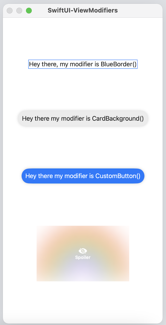
Here is a visual representation of the examples above:

Download the Swift Playground here
Caveats
-
Watch out for missing qualifiers, we eliminated risk in the examples, but i recommend you to read this article in the resources section to understand the risks.
Conclusion
SwiftUI ViewModifiers are a powerful tool for customizing and enhancing views in your app. They allow you to encapsulate common view modifications into reusable, composable units, making it easy to apply the same changes to multiple views throughout your app.
Resources:
-
https://developer.apple.com/documentation/swiftui/reducing-view-modifier-maintenance
This is the documentation about the View Modifiers from apple -
https://www.danijelavrzan.com/posts/2023/02/card-view-swiftui/
I used this post from Danijela Vrzan to create theCardBackgroundexample. -
https://blog.eidinger.info/make-your-swiftui-view-modifiers-safer
I used this post to understand the risks of missing qualifiers in the ViewModifiers. -
https://sarunw.com/posts/swiftui-viewmodifier/
I used this post to create theSpoilerexample.
The code is based on theNSFWexample in the post of Sarunw.
Read more
- Implementing Sign in with Apple • 6 minutes reading time.
- @ViewBuilder in Swift • 4 minutes reading time.
- async/await • 6 minutes reading time.
Share
Share Bluesky Mastodon Twitter LinkedIn Facebook
