Custom Tabbar with SwiftUI
In this post, we will explore how to create a custom tab bar using SwiftUI.
What is a TabView?
A TabView is a user interface component that allows users to switch between different views or sections of an app. Unlike the default tab bar provided by SwiftUI, a custom tab bar can be tailored to fit the specific design and functionality needs of your application.
How to Build a Custom TabBar in SwiftUI
SwiftUI’s built-in TabView is great for quick setups, but sometimes you want more control over the look and feel of your app’s navigation. Whether you're aiming for a sleek, animated tab bar or something that matches your brand’s aesthetic, building a custom tab bar in SwiftUI is surprisingly approachable.
Step 1: Define Your Tab Items
We'll start by creating a model to represent each tab:
enum TabItem: String, CaseIterable {
    case home = "house"
    case search = "magnifyingglass"
    case profile = "person"

    var title: String {
        switch self {
        case .home: return "Home"
        case .search: return "Search"
        case .profile: return "Profile"
        }
    }
}
Step 2: Create the Custom Tab Bar View
Now let’s build the tab bar UI:
struct CustomTabBar: View {
    // This will update our selected tab
    @Binding var selectedTab: TabItem

    var body: some View {
        HStack {
            // Walk through each tab item
            ForEach(TabItem.allCases, id: \.self) { tab in
                // Add a spacer (before the item)
                Spacer()
                VStack {
                    // Tab icon
                    Image(systemName: tab.rawValue)
                        .font(.system(size: 20, weight: .bold))

                    // Tab title
                    Text(tab.title)
                        .font(.caption)
                }
                // By placing the foregroundColor modifier here, the color gets changed in all components in our VStack.
                .foregroundColor(selectedTab == tab ? .blue : .gray)
                // On tap, we update the selected tab with animation.
                .onTapGesture {
                    withAnimation {
                        selectedTab = tab
                    }
                }
                // This makes the entire tab area accessible
                .accessibilityAddTraits(.isButton)
                // Add a spacer (after the item)
                Spacer()
            }
        }
        .padding()
        // Set the background color and shadow
        .background(
            Color(.systemBackground)
                .shadow(radius: 2)
        )
    }
}
This view uses @Binding so it can update the selected tab from the parent view.
Step 3: Create the Main View
Now let’s create the main view that uses the custom tab bar:
struct ContentView: View {
    // This will save our selected tab
    @State private var selectedTab: TabItem = .home

    var body: some View {
        VStack {
            switch selectedTab {
            case .home:
                Text("Home") // Replace with your Home view
            case .search:
                Text("Search") // Replace with your Search view
            case .profile:
                Text("Profile") // Replace with your Profile view
            }
        }
        // We'll set the max width and height to fill the available space
        .frame(maxWidth: .infinity, maxHeight: .infinity)
        // We'll place our custom tab bar in the safe area.
        .safeAreaInset(edge: .bottom) {
            CustomTabBar(selectedTab: $selectedTab)
        }
    }
}
Each tab displays a different view, and the tab bar sits at the bottom.
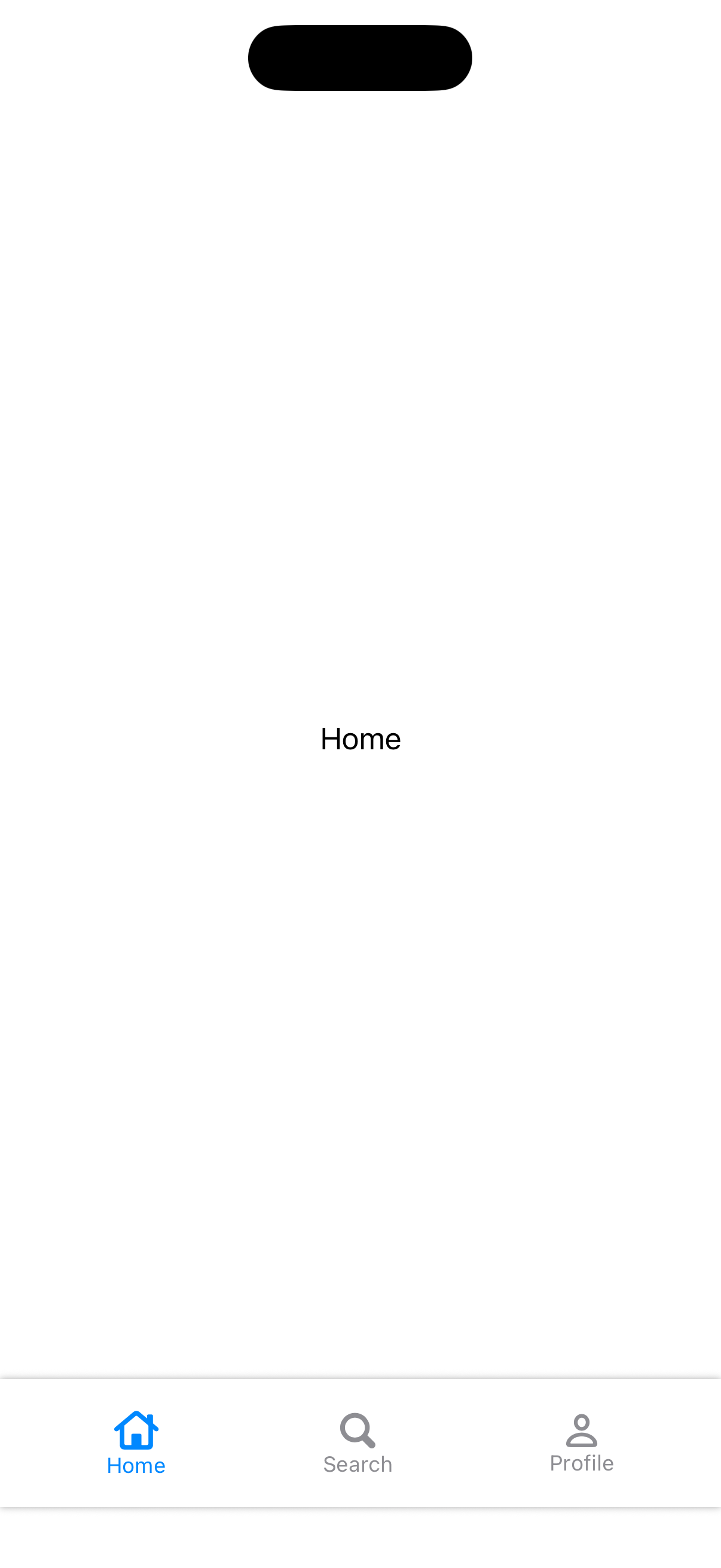
Screenshot
Conclusion
Building a custom tab bar in SwiftUI is a straightforward process that allows for a high degree of customization, it is a great way to enhance the user experience in your app.
Resources:
Read more
- Safari in SwiftUI • 2 minutes reading time.
- self, Self, and Self.self in Swift • 3 minutes reading time.
- Placing components within the Safe Area Inset • 3 minutes reading time.
Share
Share Bluesky Mastodon Twitter LinkedIn Facebook