Popovers in SwiftUI
In SwiftUI, popovers are a great way to present additional information or options without navigating away from the current view. This post will explore how to create and customize popovers in SwiftUI.
Use Case for Popovers
Popovers are particularly useful when you want to display contextual information or options related to a specific element in your user interface. For example, you might use a popover to show additional details about an item in a list or to present settings options without cluttering the main view.
PresentationAdaptation struct
In SwiftUI, the PresentationAdaptation struct is used to define how a view should adapt when presented in different environments, such as compact or regular size classes. This is particularly useful for popovers, as it allows them to behave appropriately across various device orientations and screen sizes.
When you use the .presentationCompactAdaptation(_:) modifier, you can specify how the popover should adapt when the device is in a compact environment. For example, you might want the popover to appear as a full-screen modal in compact mode instead of a small popover.
The options are:
.automatic
Use the default presentation adaptation..none
Don’t adapt for the size class, if possible..fullScreenCover
Prefer a full-screen-cover appearance when adapting for size classes..popover
Prefer a popover appearance when adapting for size classes..sheet
Prefer a sheet appearance when adapting for size classes.
Popover Modifiers
In this tutorial, we'll use 2 key modifiers to create and customize a popover in SwiftUI:
-
.popover(isPresented:attachmentAnchor:arrowEdge:content:)
This modifier gives you some options to customize the popover's behavior. You can specify whether the popover is presented, where it should attach to the view, and which edge of the popover should point to the anchor. -
.presentationCompactAdaptation(_:)
This modifier allows the popover to adapt to compact environments, such as when the device is in landscape mode or when the screen size is smaller. It ensures that the popover behaves appropriately across different device orientations and sizes.
Code
struct Popovers: View {
@State
private var popoverVisible: Bool = false
var body: some View {
Button("Toggle Popover") {
popoverVisible.toggle()
}
.popover(
isPresented: $popoverVisible,
arrowEdge: .top
) {
popoverView
.presentationCompactAdaptation(.popover)
// This modifier allows the popover to adapt to compact environments
}
}
var popoverView: some View {
Text("You have pressed the button!")
.padding()
}
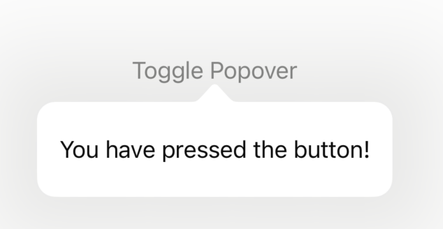
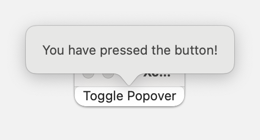
}Screenshots
iOS
macOS
Conclusion
Popovers are easy to implement in SwiftUI and provide a clean way to present additional information or options without disrupting the user's flow. By using the popover modifier, you can easily toggle the visibility of a popover and customize its content.
Read more
- Implementing Admob in SwiftUI • 7 minutes reading time.
- Inspect: A Powerful Tool for SwiftUI Developers • 3 minutes reading time.
- Customizing macOS windows • 6 minutes reading time.
Share
Share Bluesky Mastodon Twitter LinkedIn Facebook